
Step Into The Joy Of Living With Colour!

Harlequin
BY NORA BOUZ - WELL-BEING building DESIGNER
“People observe the colours of a day only at its beginnings and its ends, but to me, it's quite clear that a day merges through a multitude of shades and intonations, with each passing moment. A single hour can consist of thousands of different colours. Waxy yellows, cloud-spat blues, murky darknesses”.
-Markus Zusak
Our natural world is inherently colourful, with many hues that change throughout the day, from the warm sky colours of dusk and dawn to the cooler colours in the middle of the day. The plant world demonstrates radical changes in colour through the seasons in most parts of the world. Regularly, our nature offers us a variety of vibrant, muted, soft, loud colours that impact our emotions and moods.
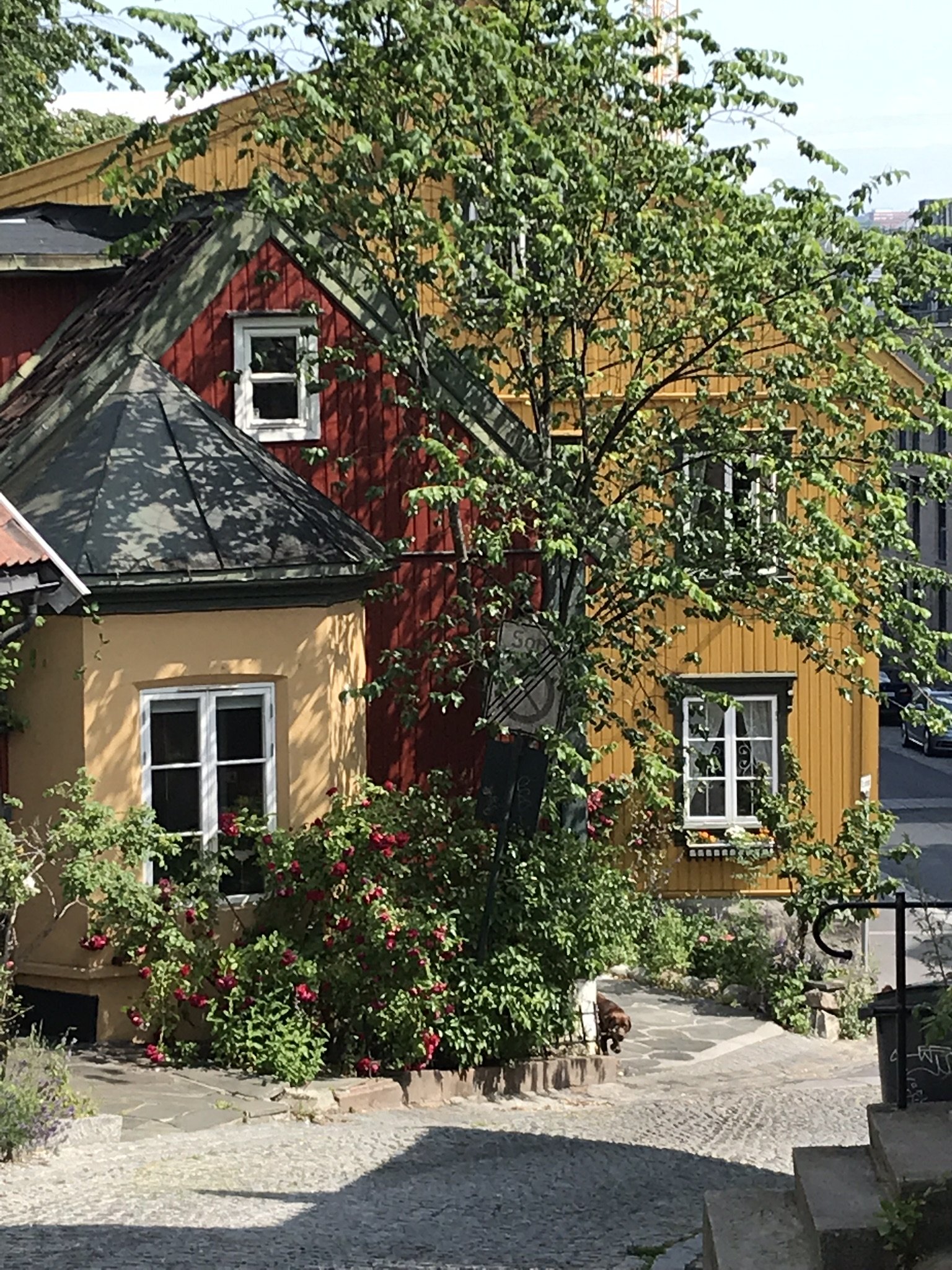
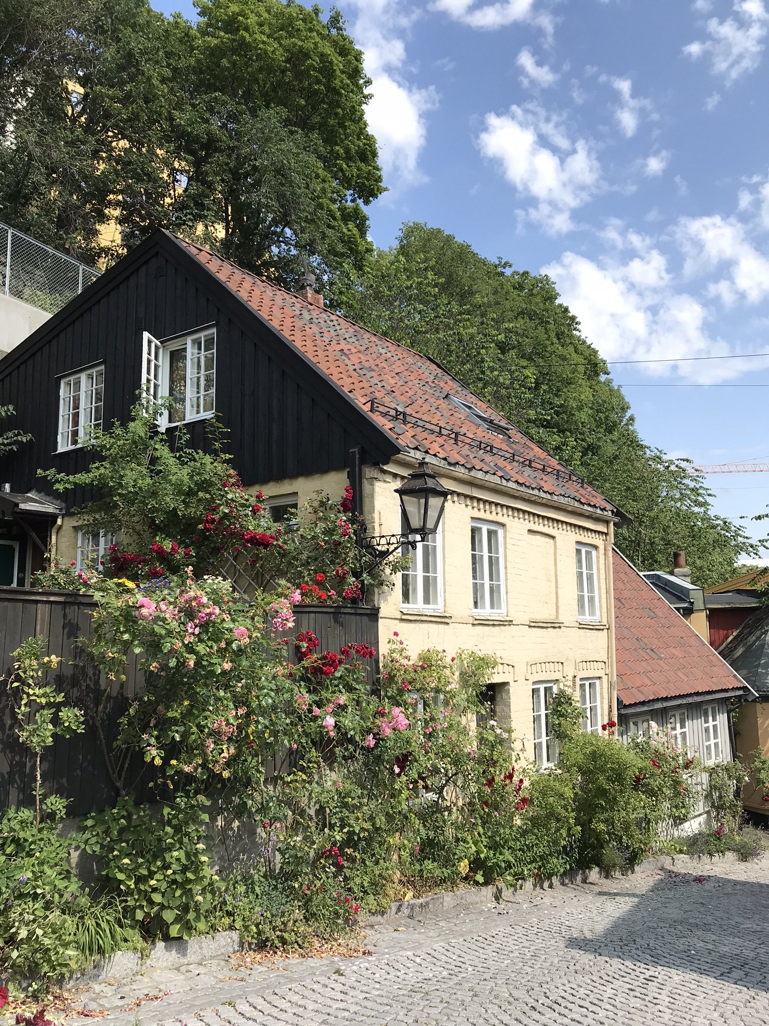
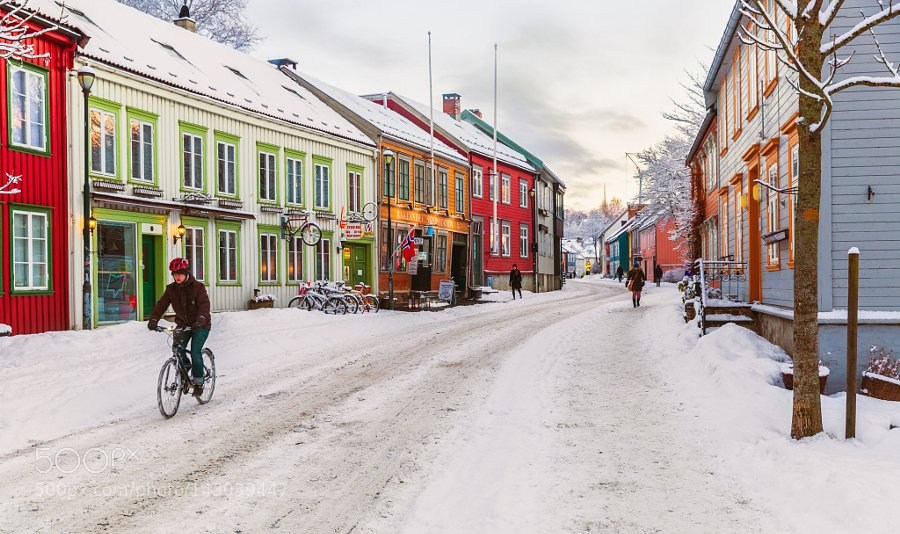
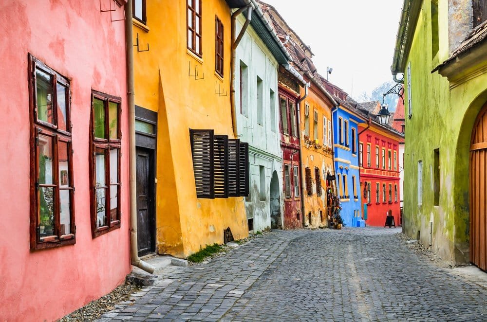
Historically, we saw many cultures and cities adopt a colour palette that brought uniqueness and vibrancy to their streets. The warm colours of Seville, the pastels of Vienna, the blues of Greece…
Yet, in modern times, we have seen a global shift in design and construction to two simple colours: white and grey.

So, what’s the reason behind this greying trend?
About three months ago, I joined a lecture organized by the International Association of Color Consultants with speaker Kine Angelo, a lecturer and researcher at the Faculty of Architecture and Design at NTN University, Trondheim, Norway.
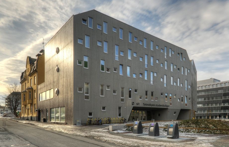
Angelo shared that in 2015, The city of Trondheim noticed that most of the houses and buildings are turning grey or white from their traditional vibrant colours that have been a staple for centuries. An investigation took place interviewing architects, designers, builders and developers, questioning why they turned to these two colours.
The feedback was quite surprising yet simple:
'Colour is tricky. We have made many costly mistakes with colours that were too bright, too dull, or just wrong. Using grey and white is fast and safe.'
Architects and designers were not getting the proper education on selecting colours successfully and creating attractive and harmonious colour palettes. In some cases, people with no design backgrounds were picking colours.
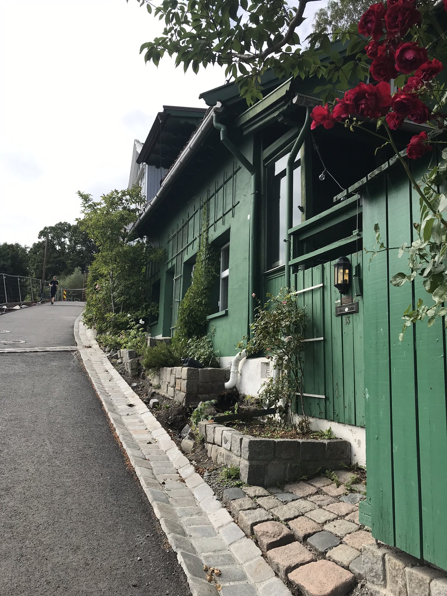
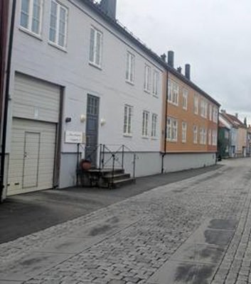
The first 2 photos show the increased use of grey. And in the next two, new attempts of using colours don’t seem quite successful.
So, what’s the problem with using grey and white?
For Trondheim and many other cities with a long grey winter, this meant robbing the people of a vibrant city that once brought aliveness and joy during those frigid months. This phenomenon also took away the identity of these places and cultural heritage and forged everyone into an impersonal uniform —the sense of place and belonging lessened. A building in Kuala Lumpur looks no different than a building in Vancouver, and a home in Milan might as well be in Calgary, Shanghai, or Portland.
How did people historically know just the right colour tone and combinations?
You don't walk the streets of old Oslo, Seville, or Marrakesh and think: these colours are awful, they don't work together, what were they thinking?! No, you walk in amazement and awe for the beauty and harmony of each colour palette that made each city.
So how is it that people mastered using colours composing complex palettes with limited access to diverse colours and technology, while today, the paint industry offers an endless amount of colours, yet, we turn to the two most easy and impersonal colours to use everywhere, ignoring our needs for a full spectrum of colour, especially those which bring us joy and delight?

A successful peach! Oslo, Noreay
The answer is not surprising: In the past, people lived connected to nature, the master colourist; they had the time to observe and deeply understand how colours work individually and together and applied them in their environments: on their walls, in the streets, inside their houses on their furniture, fabric, and objects.
Since the industrial revolution, the gap between us and the natural world has gotten larger, which caused us to lose our understanding of the natural world on many levels, including its colours.
How can we select colours to successfully elicit the feelings we want?
There is the notion that a single colour can elicit a feeling of joy, a colour that supports focus or creativity, a colour for love, for bliss, etc. This is somewhat true; for the most part, it's not. Once again, let us turn to science for an explanation.
Most scientific experiments are done with coloured lights, where the experiment takes place in a white painted room, and coloured light is applied, not in a room painted with that colour. The difference is that the painted rooms, without the coloured light, didn't register any significant impact on the subjects’ heart rate, blood pressure or brain activities, so colour scientists focused their efforts on light. But don't give up just yet, there is more.
In a recent webinar I attended, Stephen Westland -professor of Colour Science and Technology at the University of Leeds and colour researcher of 20 years- shared that there is very little evidence that a single colour makes an impact on heart rate, blood pressure, or brain activity, with very few exceptions: The green light. That’s the topic for another blog.
So after a long lecture citing multiple recent experiments by Ph.D. students, Dr. Westland concluded that the most influential element that impacts how colour impacts us is Association.

Pierre Sauvage Design, Paris - Photo: Architectural Digest
A blue room might bring calmness to most people as they associate it with the ocean. Sitting on the beach watching the waves crashing and listening to the soothing sounds is quite calming for most. Walking into a blue room will trigger this association. Surprisingly, the colour research related to blue light showed that blue light caused increased alertness and insomnia.
Although those of us with similar cultural backgrounds have similar associations, someone might have an unpleasant personal memory related to these colours, so they would have opposing feelings and preferences.
Here's how it works
Suppose I am to design a pod or a room for the sole purpose of eliciting calmness and serenity. In that case, I can mindfully pick a shade or more of green or blue (depending on the people's preferences) and apply them to every single inch of this pod where people spend no longer than 20 minutes.
But suppose I'm to create a living room in a home to elicit the same emotions of calmness and serenity. In that case, one way to do it is to put together a palette with green or blue as the dominant colour in the palette, applying a variety of chroma percentages (explanation in the following paragraph) with the right supporting colours to create a harmonious and balanced colour palette and environment for people to live in and spend extended periods.
You see, the intensity of a room with one colour wears us down and can create an opposite effect if we stay in this environment for an extended period. We are complex beings with a multitude of emotional needs that must be met.


The science of using colours successfully
While some have the gift and ability to put together successful colour palettes, others need science. Colour institutes around the world offer formulas and support in using colours successfully. For example, in North America, Pantone developed a colour system and standard offering training for the marketing industry, graphic, fashion and product design. These industries don't take colour lightly because colour helps them sell products. They depend on choosing the right ones.
The fundamentals of colours
We start with the elementary colours, Yellow, Red, and Blue. Some scientists include Green. Before we start mixing these colours, we need to understand the 'hue.' A pure hue has 100% chroma (pigment), 0% white, 0% black. A hue could have 70% chroma, 20% white and 10% black, while another hue can have 50% chroma, 30% black and 20% white. A successful formula to choosing hues that work together, besides that you find their combination pleasant, is to have the same percentages of chroma, white and black.
You've probably heard the term ‘muted colours.’ This is about the percentages of black and white added to the chroma. While it is essential to refer to the formula at the beginning, your eyes will get used to detecting the colours with similar chroma, white, and black percentages with practice.
Today, the city of Trondheim is getting its colours back. The first step was through education and information. An in-depth study of colour, its impact on people and community, how light impacts colours and scientific formulas to choose the right colours and for the different purposes and functions are some of the newer curriculum architecture and design students enjoy.
As a first step, and if you are a colour lover but feel shy or afraid to bring colours into your home, I encourage you to go for a walk in wild nature and observe. You can start by observing a rock with different patches of moss species, perhaps some leaves and sticks have fallen on it, or some small flower peaked on edge. You can observe dusk and count how many colours are present.
The language of colour is like any other language; it has its vocabulary, nuances and expressions, and the good news is that it can be learnt!
Stay tuned for my next blog and newsletter, I will be sharing more about the world colours, and I will be soon announcing the dates of the Colour Workshop.
With Joy and Delight!
nora
